It is looking better than ever with all the new ideas and great opportunities headed your way. After looking over the new color trends for 2014, you will be excited to get started incorporating them into your everyday decorating.
Here is the link to the spring color trends from Pantone
With spring right around the corner these absolutely magnificent options provide a truly endless array of possibilities for those interior-decorating projects.
Here are a few highlighted colors that are particularly interesting.
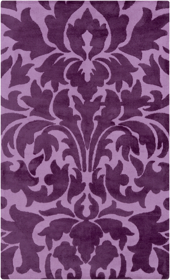
The radiant orchid purple is a very popular trend for 2014 and is warm and inviting. Using the orchid purple will make any house feel like a home, and in small quantities will give any room the pop of color it may need. Adding it in an area rug, wall decorations, or even pillows can create a dramatic effect. This particular shade of purple has even been said to be “the color of 2014” with no surprises as to why.

The link above displays just that. Here you will see a beautiful area rug with the orchid purple incorporated within the design. This would be a perfect color scheme for spicing up a child’s bedroom, or giving that entryway the warm vibrant feel you have been looking for. Also this area rug, with its unique, and modern feel could tie any room together. Perhaps a new light fixture, or vase filled with flowers to match your new area rug, and you’ve got a whole new look.
Cayenne Colors
Here is the next color I want to point out, and this is actually one of my personal favorites of the 2014 spring color trends. This is a wonderful example of the Cayenne color. Wow, this color just jumps off the page. It’s not too dark or to light, but that perfect blend of cool and warm tones. You can most definitely feel spring in this splash of color. When I see this color the first thing that comes to my mind is chevron. I am a huge fan of chevron and when I see this color paired with any shade of white in a chevron pattern, I just absolutely love it. Especially in an area rug. Also this particular shade goes perfectly with teal, so a chevron area rug, or any area rug with some teal accents throughout a room, could really give it a whole new personality.
Dazzling Blue and Freesia Colors
These two colors compliment each other so well. The blue really gives the room that modern feel, and the freesia gives it just enough color so that the room doesn’t feel to dark, or like its made the space feel smaller, which is a problem a lot of us run into when trying to incorporate darker tones. The freesia really gives the room a focal point that focuses your attention away from the darker color, while still being able to enjoy the dazzling blue feel, and this is something I think would look stunning in an area rug, to have these colors play into each other and accent each other in a way that really works for the space.
Sand Colors
The last color I want to look at is the sand color. I think this color trend has a lot to offer because it’s so versatile. It almost looks like a lighter version of a Carmel coffee color. It really offers a relaxing feel, while making everything light and flowing. In the picture displayed the designer was rite to add those white accents because it really brings a classic feel to the space. I think a white or earth tone area rug in a space similar to this or with this color pallet would be brilliant. Nothing says home more then a relaxed, calming space.
In conclusion, I am so excited about these new color trends, I think there are so many possibilities to explore and new things to try here, and I know that area rugs are the answer, they have the ability to bring a whole new dynamic to any space or room, and with these new color trends the possibilities are endless.